Security UnityCybersecurity2023
Security Unity
Security Unity was a B2B cybersecurity company in Berlin. Its brand runs on hacker paranoia: an eye for a logo, walls of code, and the line “They're already watching.”
Identity for a Berlin cybersecurity firm: an eye mark, a look built from code and characters, and a billboard, bags and USB drives.
Security Unity was a cybersecurity company in Berlin that sold to other businesses. I built its brand around the feeling that makes a company call a security firm in the first place: someone is watching.
1. The mark
Most security brands try to look like a bank: blue, a shield, a padlock. This one starts from the threat instead. The mark is an eye, and the wordmark next to it is set in Whyte, plain and sharp, so the eye does the talking.
2. Hacker paranoia
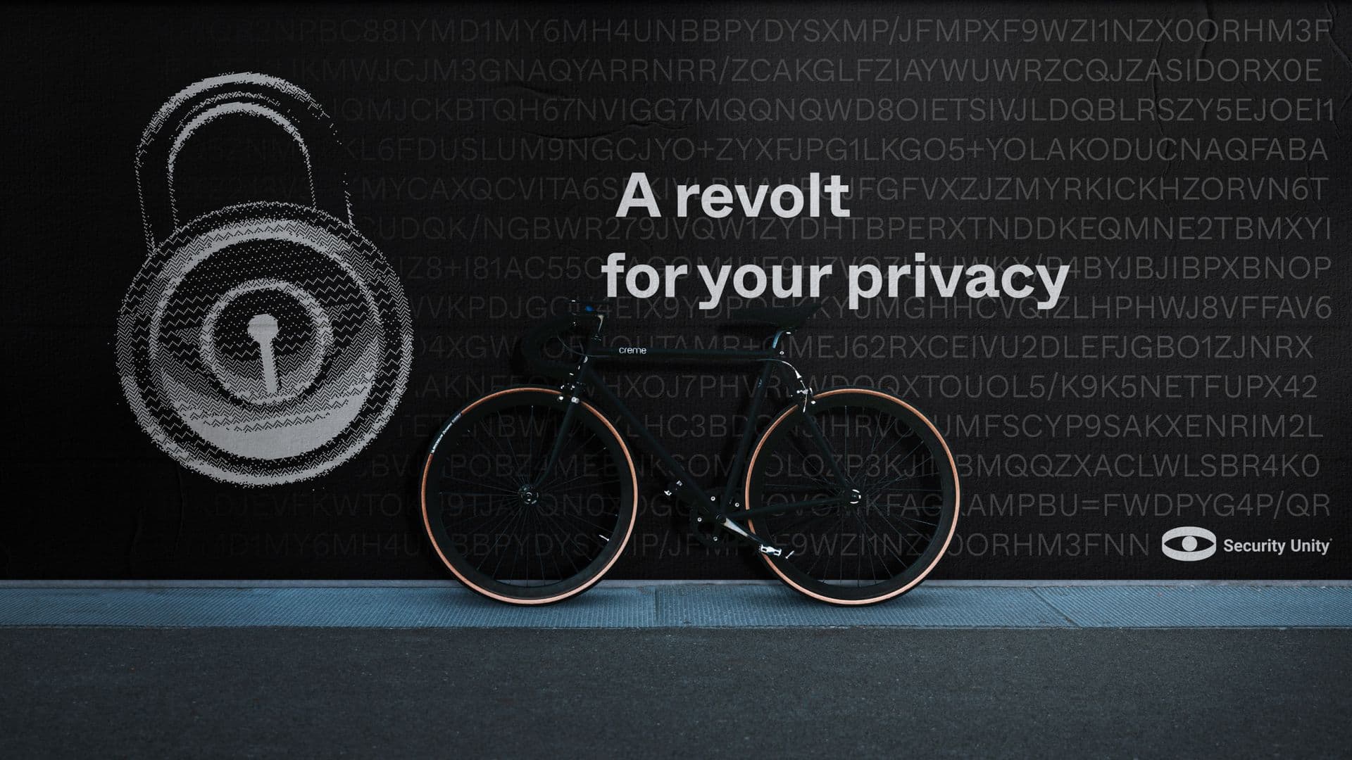
Everything else looks like it came off a screen someone else is reading. Black and white, walls of scrambled characters, and pictures drawn out of text and dots: a padlock, a classical bust, even the letters. The lines are short and a little menacing. “A revolt for your privacy.” “Your privacy matters.” “They're already watching...”
3. Out in the world
It ran on a billboard, on shopping bags, and on branded USB drives, which is a nice touch for a security firm. A stranger's USB stick is the first thing they tell you never to plug in.
Security Unity has since been sold to a German holding company, so this brand isn't in use anymore.
Delivered
- Logo
- Wordmark
- Typeface selection
- Code and character imagery
- Taglines
- Billboard
- Shopping bags
- USB drives
- Social posts
Questions
What was the idea behind the Security Unity brand?
Hacker paranoia. Instead of looking safe and corporate, the brand looks like the threat: an eye for a logo, walls of scrambled code, and lines like “They're already watching...”
What did the Security Unity identity include?
An eye mark and a wordmark set in Whyte, a black-and-white look built from code and characters, taglines, a billboard, shopping bags, branded USB drives and social posts.
Want one of these for your product?