BlissfulCafé & bakery2022
Blissful Café & Bakery
Blissful is a café and bakery in London. A new logo, a set of pastel icon tiles, and packaging for everything it hands over the counter.
A new identity for Blissful, a London café and bakery: a cake-slice logo, pastel icon tiles, and packaging from cups to cupcake boxes. Sales rose 40% in two months.
Blissful is a café and bakery in London. Coffee, cake, and the small joys that come with them. Nothing was wrong with their old look. They just wanted to stop looking like every other café on the street, so I gave them a new identity: a logo, a set of icon tiles, and packaging for everything they hand across the counter.
1. The mark
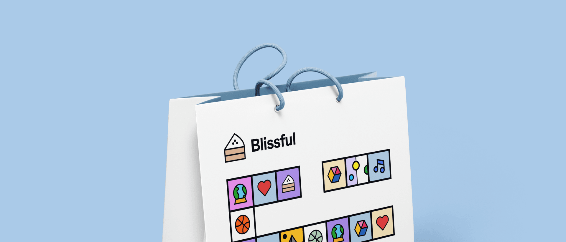
The logo is a slice of cake, drawn so it also reads as a little house: layered sponge, a pitched top, three dots of icing. Next to it, Blissful in a heavy, friendly sans. It's simple enough to print on anything, in one colour.
2. The tiles
The rest of the identity is a set of square tiles in pastels, each with a thick black outline and one small thing inside: a heart, a globe in a snow globe, a music note, a slice of cake, a leaf. They never sit in the same arrangement twice. Every cup, bowl and box gets its own mosaic, and every one is still obviously Blissful.
3. Everything they hand over
Then the tiles went on everything. Takeaway cups, each drink in its own colour with its name on the label. Dessert bowls, a cup carrier, shopping bags, bags of coffee beans. The cupcake box says Enjoy inside the lid, so the first thing you see when you open it isn't the logo.
4. What changed
The café told me sales were up 40% over the next two months. I did all of this remotely, so I never saw a cup in anyone's hand. The café has changed management since, and its branding with it, so this isn't what Blissful looks like today.
Delivered
- Logo
- Icon tile system
- Colour palette
- Takeaway cups
- Dessert bowls
- Cup carrier
- Cupcake box
- Shopping bag
- Coffee bag
- Business cards
Questions
What did the Blissful rebrand include?
A cake-slice logo, a system of pastel icon tiles, and packaging: takeaway cups, dessert bowls, a cup carrier, a cupcake box, shopping and coffee bags, and business cards.
How does the Blissful packaging stay consistent?
Every piece uses the same square tiles, each holding one small thing like a heart or a music note, arranged differently on each item. The arrangement changes; the tiles, outlines and pastels don't.
What did the rebrand change for Blissful?
The café told me sales were up 40% over the two months after it launched.
Is this still Blissful's branding?
No. The café has changed management since, and its branding changed with it.
Want one of these for your product?